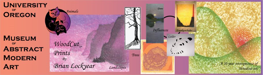


The task this week was to produce a poster for a first art show at the musuem. I decided that since it is my musem I would select me for the first artist! Here are three images I generated for the poster, getting progressively better I think. The final image is pretty much the one I handed in.
The most difficult issues for me were learning how to make the fade work from side to side. Sounds simple doesn't it?? Well, the default fade has about 10 color steps along it and I only wanted two. I kept sliding the step markers to the left and the right and could not get rid of them! Turned out that you had to pull them off vertically, then they disappeared nicely.
Next there were issues with getting text to show, particuarly against the colored backgrounds and the images I was displaying. In particular the right hand image of Summer was so textured that it was very difficult to show. I played with some white text, black, and red with a black border around it. This last seemed to show the best over top of the Summer image.
I also manipulated some of the wood cut images by doing a live trace on a black and white image, then removing the background paper color to let the sub-layers of the poster show through. In the case of the Yin and Yang cats, I went back and did an interesting gradient fill into the open areas around the cats. In the final version that I printed I removed the white background from the center black tree image which reduced it's glariness a lot.
Finally, I fiddled with the background colors. The yellow-green fade I finally ended up with worked nicely with the colors of the woodcuts and text (especially the Summer image on the right hand edge) and it also fit with the whole UO scheme! Ducks rule!


1 comment:
Brian,
I was intrigued to see your artwork as you have created some beautiful pieces. My taste would be to see a quieter presentation and a better differentiation between your work and your sources.
One way to do this would be to pick out your own high contrast prints, i.e. all including black or all having autumn tones. Then you could show the influences more as a quiet series of lower contrast thumbnails.
While I appreciate the free flow and overlap of images, my eye wants more order. Rather than seeing the artwork, I am reading blocks of different color schemes. You might enjoy reading Edmund Tufte's Envisioning Information that has a neat chapter on how standardized layout helps the reading of Small Multiples.
Technically, the pink landscape needs to be scanned at a higher resolution; you were much more successful at reproducing the orange circular print and the orange and green print.
The fonts that you chose are strongly decorative. Rather than dabbing them on, see if you can get them to work as bod graphic objects. Think about the role of each phrase, its importance and its relationshi to the other words. Here are two that play with words nicely: extreme sports & WPA mural poster.
Glad to see you got the gradient to work. Keep practicing.
Nancy
Post a Comment